Graphic Design
Logo Design
Supe
Apr 2010
Supe is a mobile soup van retail concept, aimed at bringing convenience to people stationed at inconvenient no-food-nearby places by stopping timely at strategic locations to serve great-tasting soups.
The logo design made use of cheerful orange and delicate purple with a lively font style to deliver an identity that fits the bill of the retail concept. The abstract shape of a bowl identifies its core product.
Supe's slogan, "Soup from Supe, Here for Good!", was also conceived to complement its branding efforts.
The name, Supe, was conceived by Pamela Tsao.
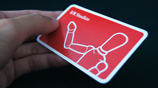
Logo & Name Card Design
UX Studios
Nov 2009
This logo was designed for UX Studios, a team of user experience-centric application developers.
Like how artists and designers look upon the manikin to streamline their drawings, UX Studios is driven by this spirit to craft the best possible user experiences, tailor-made for its target audiences.
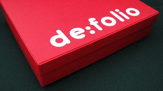
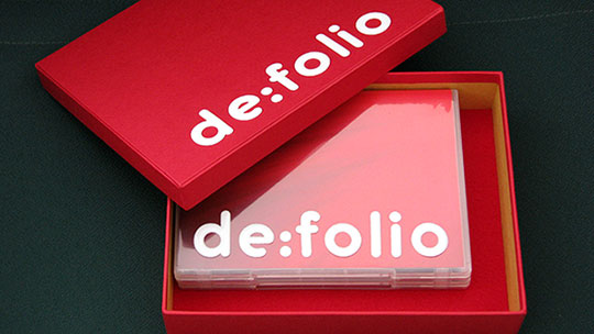
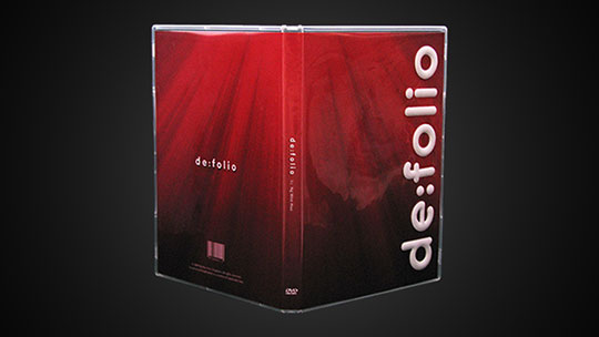
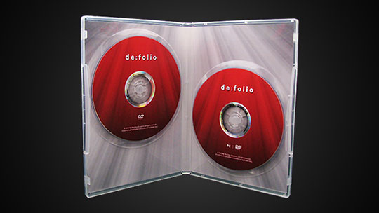
DVD Packaging
de:folio
Apr 2009
This is the packaging of a DVD portfolio featuring a series of media design and video production work produced during the course of Designing Content for New Media (NM3208), a module offered by the CNM Department at NUS.
Entitled de:folio, this is an addition to the Design Everywhere (DE) family. Design Everywhere started off as an identity established for a design blog.
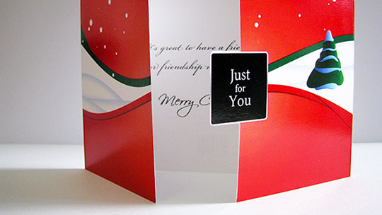
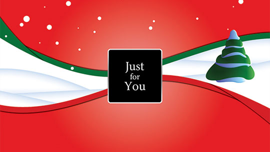
Greeting Card Design
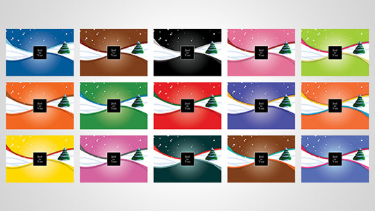
Just for You
Oct 2008
In addition to visual aesthetics, the design process included the consideration of aspects such as how a recipient opens the card to uncover its inner messages, and what card size offers better handling.
The colour scheme was selected—out of 15 combinations—to infuse a clear-cut Christmas feel.
This card was produced during the course of Principles of Visual Communication (NM2208), a module offered by the CNM Department at NUS.
Logo Design
Design Everywhere
Aug 2008
This logo was designed for Design Everywhere, a design learning blog.
The circle represents a globe, which symbolises everywhere. The abbreviation—DE—engraved on the globe through a combination of arrows, conveys the different directions and diversity in design, and also enforces the Design Everywhere identity.
The letters are in Carbon Block typeface by Ray Larabie.